JOYTLE

Project Overview
For this project, we were tasked to design both the brand identity and a companion website for a company or project of our own creation. Inspired by my love for animals and my experience volunteering with children. I created Care Cubs - a childcare center concept focused on nurturing empathy and kindness toward animals through hands-on experiences and education.
Logo Design Process
Research
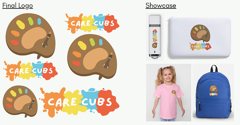
I began by researching playful and child-friendly logo styles, compiling a moodboard of examples and art styles I liked. Next I looked at fonts, focusing on handwritten ones to emulate a child’s writing and narrowed my choices to three options. As for color, I selected a light brown inspired by a bear cub’s fur and paired it with the first five colors of the rainbow - drawing from familiar childhood associations such as crayons and colored pencils. This palette helped establish a warm, friendly, and energetic tone.

Ideation
I created 20 hand-drawn sketches exploring themes such as:
-
Bear cub paw prints
-
Childhood creativity (paint, rainbows, toys)
-
Human–animal interaction
These concepts aimed to combine playfulness with empathy.

Selection
I then chose three to refine digitally, using Procreate:
-
A paint palette arranged to resemble a bear cub paw print, with variations including paint splatters

-
A silhouette of a child petting a dog, with “Care Cubs” encircling the figure

-
Children cut out from a bear paw shape, with subtle heart symbolism in the arms

Final Chosen Logo
Finally, I chose the first one as I felt this direction best captured both creativity and animal care while remaining visually engaging. The LazyDog font was chosen for its thick strokes and handwritten feel, reinforcing a childlike tone while remaining legible.
Website Design Process
Research
Building on the established brand identity, I wanted to design a website that reflected the same playful and welcoming personality.
I studied existing childcare websites such as My First Skool, SparkleTots, and Star Learners to understand common layouts, content structure, and visual approaches. From this, I defined an art style that stayed consistent with the logo - fun, soft, colorful, and inviting.
Typography & Colour
To maintain brand consistency:
-
LazyDog was kept for headers
-
Outfit for navigation and better readability
-
Kanit for body text as a more formal yet compatible typeface
The website uses the same color palette as the logo, with slight shade variations to create hierarchy while keeping a cohesive visual identity.

Wireframing
I explored three layout ideas:
-
A multi-page structure
-
Horizontal scrolling
-
Vertical one-page scrolling
I ultimately chose a single-page vertical scroll, allowing users to smoothly navigate all content in one continuous flow.

Visual Design & Assets
Since the logo was hand-drawn, I illustrated all website assets myself to maintain stylistic consistency. I chose an outdoor playground and garden theme to reinforce the childcare setting and sense of exploration.

Prototyping
During prototyping, I refined the layout beyond the original wireframes:
-
The About section was split into two parts for clarity
-
Locations were combined into a single section
-
Programs were divided into Indoor and Outdoor, with a small image carousel for users to browse at their own pace
-
Location buildings feature hover interactions that scale up and reveal details
-
The Join Us section includes a garden patch where darker soil areas act as watered plots
All images used in the prototype were photographed by me.
Below is the final prototype, feel free to interact with it!
Personal Reflection
Overall, I was pleased with how the logo and website came together. However, if I were to revisit this project, I would simplify parts of the logo by focusing on a single element instead of having both the paint palette and paint splatters. As well as to further enhance the website with additional animations to increase interactivity.
This project strengthened my ability to translate values, like empathy and playfulness, into visual systems across both branding and digital design, while maintaining consistency from concept to final execution.